| CHOOSING THE BEST MAT COLOR |
 |
|
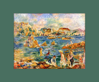
Choosing a matboard for your framed artwork is not always a simple matter. While basic white tends to work for a wide range of images, if you want to give your art a bit more of "oomph," you will need to spend some time considering the artwork itself, and the effect you want your mat to have. If an artwork is framed in a suitable, complementary mat (or mats), the framed piece will shine. The wrong mat color, however, can dull or even detract from the artwork.
|
SUMMARY
| ARTWORK COLORS |
EFFECT OF DIFFERENT COLORS |
DOUBLE MATS |
MAT COLORS |
- Determine the dominant color of the piece
- Determine the secondary colors
|
- Modern style
- Cool and Warm tones
- Emphasize focal point
|
- Complementary mat colors
- Darker color as the bottom mat/reveal
|
- Many different whites
- Neutrals for matching decor
- Using bold colors
|
|
| DETERMINING THE COLORS IN YOUR ARTWORK
|
|
|
Before you begin picking out mat colors for your artwork, it is important to determine the general color palate of the piece itself.
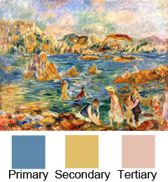
Step back from the artwork, and look at is as a whole. What colors seem most dominant to you? What color to you notice immediately, maybe the one you would use to describe the artwork in a single word. Often, the dominant color is one on the foreground, though if the background makes up much of the image, it could be that as well.
Once you have decided on the dominant or primary color, continue examining the artwork. What other colors do you notice immediately, if slightly less prominent than the first? These colors are your secondary and tertiary colors in the artwork's palate, and they are the ones from which you should select your mats.
If you choose a mat that matches or complements the dominant color in the art, you are expanding the range of focus for the viewer. That dominant color is meant to catch your eye, so if it extends to the outer borders of the piece, the viewer will quickly become confused and focus on the artwork will be lost.
By choosing mats that work with the non-dominant, but still significant, colors, you are essentially expanding the ability of those colors - making them even more capable of drawing attention to the primary color.
Existing Decor
Try not to choose a mat based on what will complement your decor. This can be a consideration, of course, but it should not be the first evaluator. If the mat you choose perfectly matches your kitchen wall, but clashes drastically with the artwork, it won't matter that it suits your decor. The badly bordered art will be far more distracting that a mat that wasn't a perfect fit to your wall paint could ever be.
Additionally, by choosing a mat based on the art, not the room, you ensure that piece will look striking on any wall, in any room or new home you move to, for the course of its display.
Frame
If you already have a frame for the artwork, its appearance should be taken into consideration at least slightly. Unless it is a bold, colored frame, mat color shouldn't affect it too much. The exception to this is a white frame. It is very difficult to match the white of the frame to the white of a matboard, especially when you must complement the matboard as well. In such cases, you may be better off with a non-white mat.
A black or natural wood frame should work with most matboards, provided it was appropriate for the artwork in the first place. Don't use mats to make an unsuitable frame style "work" with your art. You will only end up with three mismatched parts, resulting in a disjointed whole.
|
Determine the main colors in the image
|
| DOUBLE MAT COLOR
|
|
DOUBLE MATS
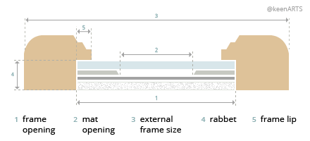
A single mat is a matboard border, traditionally about 2" wide, that surrounds the artwork and separates it from the frame and the glazing. A double mat is essentially the same thing, except a small "reveal" of another color mat lines the edge of the artwork between it and the top mat. Some things to consider if you've decided on a double mat:
- A double mat can make an artwork look stunning and professional, but it can also destroy the display if the colors are not appropriate to the image. Never decide to use a double mat because the single mat doesn't complement the artwork. That ribbon of a different color may be small, but it will not fix a poor original mat choice.
- We've already discussed making sure the mat complements the artwork, but you will also want to ensure your second mat complements the first. Just because two secondary colors are present in a painting does not mean those two colors, when solid and placed side by side, will work.
- If you have selected your colors but are having difficulty deciding which should go on top, consider the brighter or darker colors for the small reveal of the bottom mat. The lighter, more neutral color is often the best choice for the top mat.
This is not a hard and fast rule, and if your art is quite light overall a dark top mat may work well. However, if you have a dark artwork paired with a thin line of white and a thick border of dark grey or black, you can end up with a "glowing" effect that also strictly delineates the end of the artwork. Generally that abrupt stop is not desired - the eye should flow freely into the mat and then back into the artwork.
|
Light mat with dark reveal
Dark mat with light reveal
|
| WHAT DIFFERENT COLORS DO
|
|
UNIFORMITY
If you have a number of artworks or photographs that you plan to display in one room, or down a single hallway, choosing the same neutral-color mat for all of them can be a great way to create a consistency that ties the set together.
No matter how varied the collection, a soft or bright white mat can create a uniformity between the artworks, whether or not the frames are all the same, and regardless of the frame and mat sizes.
BLACK AND WHITE
Choosing a double mat of black and white gives artwork a striking, modern effect. Black and white photographs look especially stunning with this combination, due to the sharp contrast of the tint (white) and the shade (black). As mentioned above, if the photo is primarily white, a thick black with a narrow white reveal can create a clean, crisp display.
COOL AND WARM
Consider mat colors that suit that subject of the image as well as the color palate - the two are often interchangeable. For instance, warm, autumnal colors such as reds, oranges, yellows, and browns often suit a painting of a field of trees with the leaves just turning. A babbling brook with flowers along the edge, on the other hand, may best match the cool colors of springtime: blues, light greens, and violets.
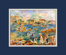
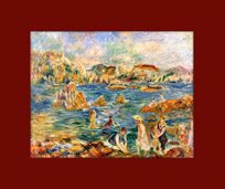
DEPTH OF FIELD
Consider the vanishing point of the artwork. If a subject of the image is receeding - a river flowing away, or a street winding off into trees or buildings - a darker mat will emphasize this effect of "drawing back."
If the artwork has strong elements in the foreground - a portrait, or a central scene with a faded or simplified background - a lighter color mat will help bring prominence to these central objects.
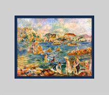
In the examples at right, both colors were drawn from the secondary colors of the image.
|
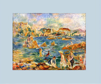
A light mat emphasizes the foreground
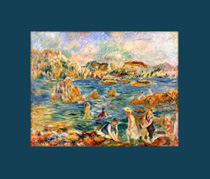
A dark mat emphasizes the background

Black and white image with light mat
|
| COLOR OPTIONS
|
|
WHITE
White is by far the most popular mat color. However, much like house paint, the term "white" is far broader than we may generally assume. Mats in the white family come in dozens of tints, and are granted various names such as Soft White, Crystal White, Digital White, Bright White, and Chalk.
Do not be tempted to assume it doesn't matter. In the case of art, white is not simply white. There is a profound difference between these tints, and you're bound to find one will complement your art while another will clash.
NEUTRALS
Neutral colors are likely the second most commonly used colors. They are available in warm tones (beige, cream) and cool tones (grey, silver). One benefit of neutrals is their tendency to match room decor. If you are determined to make your mat match your surroundings, but still want the option to relocate the artwork at some point, a neutral can provide the balance you need, and gives you options for matching the art as well.
COLORS
As long as the mat color is borrowed from one of the secondary or tertiary colors in the artwork, a color mat can work well. Consider a pale forest green for a barn in front of a out of focus forest, or light blue to complement the distant sky of a cityscape. If the color you choose is solid in the artwork and stretches to the edge - therefore blending in with the mat - consider a double mat with another, darker secondary color as the bottom mat.
|
Burgundy mat, a minor foreground color
Teal mat, matching the shadowed waves
|
| PRODUCT ORDER PAGES
|
|
|
|
 |
Custom Wood Frames:
Our quality framing solutions include a wide range of custom-made wood 7 METAL frames in various styles and sizes.
To start Click here. |
|
 |
Fine Art Paper Printing:
We offer affordable Fine Art Inkjet Printing as a custom service for artists, commercial photographers and anyone else concerned with producing top-quality archival prints.
To start Click here. |
|
|
For more information on how to select the best mat for your artwork, including history, mat widths, and custom mats, please read our All About Mats article.
We have a wide selection of matboard colors, and offer a custom cut matboard service.
|
Front Side |
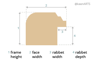
Picture framing terms |
Back Side |
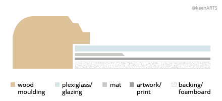
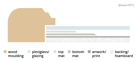
| MatBoard Guide: |
|
 Single Matboard Sample |
 Double Matboard Sample |
|
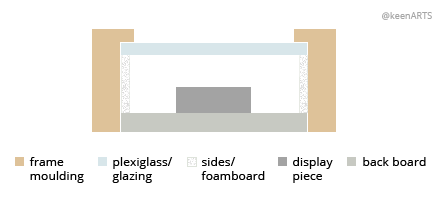
Terms:
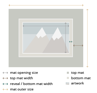
Top Mat: Top layer of a double mat; It has a larger window, which allows a small border of the bottom mat, called the reveal, to be shown.
Bottom Mat: Optional second layer of matboard used in double matting; The window opening of the bottom mat surrounds the artwork.
Reveal: Width of the bottom mat, normally 1/4", 3/8" & 1/2"
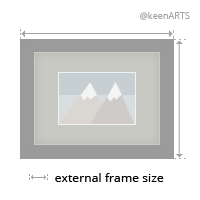
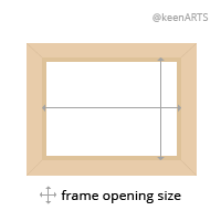
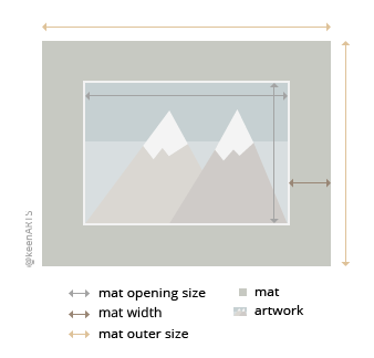
Mat Outer Size: Also known as frame opening size, matches the plexi glass or backing size of the picture frame
Artwork Size: The exact size of the artwork!
Mat Opening Size: Size of the matboard window cut out
|
|
|
Our informative articles on MatBoards:
Choosing the Best Mat Size The article offers helpful tips on selecting the appropriate mat size for your artwork.
Measuring for Mats All about Mat Outer Size, Artwork Size and Mat Opening Size
Choosing Mat Color How to select the best colors of mat fo ryour artwork
All About Mats The article discusses the different materials and attributes of picture framing mats and more!
|
| Matboard FAQs: |
|
Q1 : Does my artwork need a mat?
Whether or not to add a mat to your image is entirely up to you. If you intend to sell the artwork or pass it down as a family heirloom, an acid-free mat is a good idea to protect the image from the condensation that may occur on the glass. But if you are simply framing family photographs or an art print, the mat is a purely aesthetic option.
Order online:
Custom-cut matboards
Full sheet, 32x40" matboard
Q2 : What color is your whitest white?
We offer many shades of white mat board. Crystal White is our brightest white.
Order online:
Custom-size mats
Full, 32x40" matboards
Q3 : What is backing board?
Backing board is used to back or mount prints inside a frame.It is slightly thinner than a 4-ply matboard. It
Order online: Backing Boards
Q4 : Do you sell full sheets (32 x 40)?
We currently sell full matboard sheets (32x40") in certain colors.
Order online:
Full, 32x40" matboards
Q5 : What is the purpose of a mat?
Matting is the border that surrounds your art within the frame. Visually, the mat boards provide "breathing room" from any distractions on the surrounding wall including the frame. The other usage of Mat is separating the artwork from the plexi or glass.
Q6 : Should I get an acid-free mat or a regular mat?
Acid- and lignin-free mats guarantee no artwork degradation will occur because of the mat for hundreds of years. If you plan to sell your piece or show it in a gallery, a Museum core mat board is advisable. However, if you are simply framing an inexpensive piece or a print to show in your home, you should be fine with a regular mat.
Even our regular mats are treated with calcium carbonate to keep them acid-neutral for 100 years.
Q7 : How do I choose the best color mat?
A colored mat is a great way to enhance or draw out certain sections of your artwork. At the same time, a colored mat can have a detrimental effect if it does not flatter the artwork colors. Try laying different mats on top of your artwork to help you decide. If no color seems to fit, a mat in one of our many shades of white is always a good choice.
Order online:
Custom-size mats
Q8 : How much of my image will the mat cover?
The mat will cover 1/8" to 1/4" on each side of your image. This overlap is essential to ensure your artwork remains behind the mat and does not fall through. We recommend the default overlap of 1/4", but if your artwork has many important details along the edges that you do not want obscured, we can cut the mat to have an 1/8" overlap.
If your image has a white border around it, do not cut this off prior to matting. We can minimize the amount of overlap on the actual image if there is enough space around the edge.
Q9 : What is the difference between regular, conservation, and museum mat boards?
Regular mat boards are made from wood pulp, treated with an acid-neutralizer that minimizes negative reactions between the mat and artwork. They are our least expensive mat board.
Conservation mat boards have a core of acid- and lignin-free cotton, and a facing of wood pulp paper. They protect the artwork from acid burn and degradation for at least 100 years, and have a mid-range cost.
Museum core mat boards are made entirely of cotton rag paper. They are guaranteed to have no adverse reaction with artwork for hundreds of years. Museum mat boards are the most expensive and the best quality.
Q10 : Do you have more mat options than are on your website?
We do carry other options for mat boards, but they need to be ordered in, and this can delay your order. Please contact us if you require a different mat.
Q11 : How wide should my mat be?
The width of the mat is up to the customer, but we can provide some general guidelines.
For average sized artwork (about 11x14" to 30x20"), the common mat width is 2". If you artwork is smaller, you might consider a 1.75 or 1.5" mat. If you artwork is very large, a 3" or 4" mat may be necessary to ensure an aesthetically pleasing ratio.
Please see our article Measuring for Mats for more information.
Q12 : How do I order a mat board with my frame?
When you select the frame size to order, you will see an option to add "mats" to your order. When you select this, you can choose your mat color. The mat width is the thickness on one side, between the frame and the artwork (generally about 2"). If you are selecting two mats, the reveal is the amount of the bottom mat that will show between the artwork and the top mat.
Q13 : Do you carry different thicknesses of mat boards?
We can make your order with 8 ply mat boards in basic colors, however we do not keep them in stock, so ordering them may delay your order by a few days. We offer a wide selection of colors in the regular 4 ply thickness, and a double mat is a good option if you require a thicker division between plexiglass and image.
Q14 : Can I come into your store to choose a matboard?
If you are located in the Vancouver area, you are welcome to stop by our store and go through our mat samples. Unfortunately, we are an online business and do not have storefronts in other locations.
Q15 : Can I get a mat larger than 32x40 inches?
Unfortunately, our mat boards do not come in a larger size than 32 x 40, so we are unable to accommodate oversize mat orders. Have you considered having your artwork printed with a colored border?
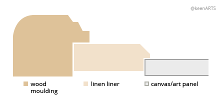
Another option for larger artwork is to purchase a linen liner. Because these are custom made like picture frames, you can order larger sizes. Please note, however, that liners are thicker than matboards, and may require a frame with a deeper rabbet.
Order online: Full, 32x40" Matboards
Q16 : What brand are your mat boards?
Our mat boards are made by Peterboro. This Canadian company has been in the paper-making business since 1902, and their products are manufactured in and distributed from Canada.
Q17 : What is the difference between mat, matt, and matte?
Though "mat" is the most widely recognized spelling, all three words mean the same thing: a rigid paper border that divides the image from the glass and the frame.
"Matte" or "matt" may also refer to a smooth, non-reflective finish.
Q18 : How many different matboard colors do you carry?
We stock 50 regular matboard colors, as well as about 30 conservation and 18 museum core colors. However, we are able to order any color you would like. Contact us if you do not see the color you want on the website. Please remember that ordering a mat we do not have in stock will delay your order a few days.
Order online, or view our full selection in stock: Matboards
Q19 : What is the mat offset?
The offset is the amount that your mat is smaller than your image. This slight overlap ensures your artwork will not fall through your mat. However, you do not need to factor this measurement into your calculations - we will automatically cut your matboard 1/8" to 1/4" smaller on each side than your artwork size.
Q20 : What calculations do I need for ordering a mat?
All you need to know is the size of your artwork, and the width of the mat border (usually about 2" on each side). Both these amounts can be entered in our online form when you place your order.
We will do all other calculations for you, such as the mat offset and the total frame size.
Please see our article, Measuring for Mats for more information.
Q21 : What is the mat window?
The mat window, or mat opening, is the space between the two inner edges of the mat - the hole through which your artwork will show. The mat window is generally 1/4" to 1/2" smaller than your artwork vertically and horizontally. This allows for the mat offset, which overlaps your image 1/8" or 1/4" on each side, keeping the art from falling through the mat.
Q22 : Can I order Custom Cut Frame MatBoards?
Yes, to order click here: Custom Cut MatBoards
Q23 : What is the fifference between 4 ply or 8 ply matbaords?
Ply is the thickness of the matboard. The most common thickness used is 4 ply (around 1/16th of an inch) and double thick matboards are 8 ply or roughly 1/8 inch thick. The higher the number, the thicker and more rigid the board. Ply means a thickness or layer.
|
|
| If you don't find the answer you're looking for here, please contact us. |
|
© 2002-2024 - KeenART Media Ltd.
|
|
| |
|